Bootstrap Login forms Code
Intro
In some cases we require to secure our priceless web content in order to provide access to only several people to it or dynamically customise a part of our sites according to the particular viewer that has been simply viewing it. However just how could we potentially know each particular site visitor's persona since there are certainly so many of them-- we must discover an straightforward and reliable solution getting to know who is whom.
This is where the user accessibility management arrives first engaging with the visitor with the so familiar login form feature. Inside the most recent fourth edition of probably the most famous mobile friendly web-site page creation framework-- the Bootstrap 4 we have a lots of elements for setting up this type of forms and so what we're planning to do right here is looking at a detailed instance how can a simple login form be created using the useful tools the latest version comes with.
The best ways to put into action the Bootstrap Login forms Modal:
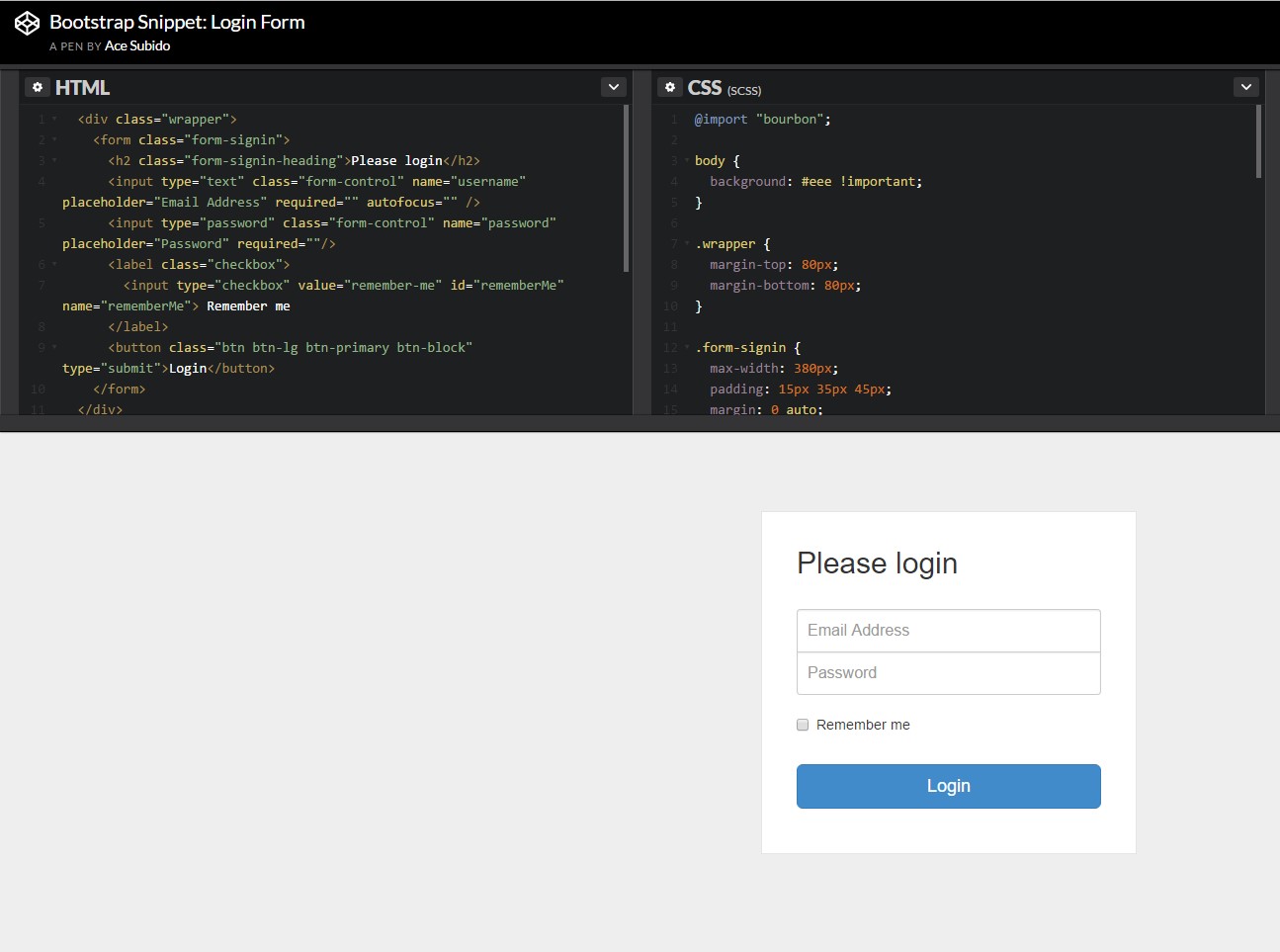
For beginners we need a <form> element to wrap around our Bootstrap login form.
Inside of it certain .form-group elements need to be contained -- at least two of them really-- one for the username or e-mail and one-- for the specific customer's password.
Usually it's more convenient to work with individual's mail in place of making them figure out a username to confirm to you considering that generally any individual realizes his email and you can easily constantly ask your site visitors later to especially deliver you the solution they would like you to address them. So within the first .form-group we'll initially place a <label> element with the .col-form-label class added, a for = " ~ the email input which comes next ID here ~ " attribute and certain relevant tip for the site visitors-- just like "Email", "Username" or something.
After that we require an <input> element together with a type = "email" in the event we need to have the e-mail or type="text" in case a username is required, a special id=" ~ some short ID here ~ " attribute as well as a .form-control class installed on the component. This will create the field where the users will provide us with their mails or usernames and in the event that it's emails we're speaking about the internet browser will also check of it's a correct email entered due to the type property we have defined.
Next comes the .form-group in which the password should be provided. As usual it should first have some kind of <label> prompting what's needed here caring the .col-form-label class, some meaningful text like "Please enter your password" and a for= " ~ the password input ID here ~ " attribute pointing to the ID of the <input> element we'll create below.
Next goes the .form-group through which the password should be given. As usual it should initially have some type of <label> prompting what is actually required here carrying the .col-form-label class, some useful content such as "Please put in your password" and a for= " ~ the password input ID here ~ " attribute leading to the ID of the <input> component we'll create below.
Next we should set an <input> with the class .form-control and a type="password" attribute with the purpose that we get the widely known thick dots visual appeal of the characters typed in this field and certainly-- a unique id= " ~ should be the same as the one in the for attribute of the label above ~ " attribute to fit the input and the label above.
Lastly we really need a <button> element in order the site visitors to be capable sending the accreditations they have simply just delivered-- ensure that you appoint the type="submit" property to it.
Example of login form
For more designed form layouts that are equally responsive, you can incorporate Bootstrap's predefined grid classes as well as mixins to build horizontal forms. Incorporate the . row class to form groups and make use of the .col-*-* classes to specify the width of your controls and labels.
Be sure to incorporate .col-form-label to your <label>-s too so they are definitely vertically centralized with their involved form controls. For <legend> features, you can employ .col-form-legend to make them show up the same as ordinary <label> components.
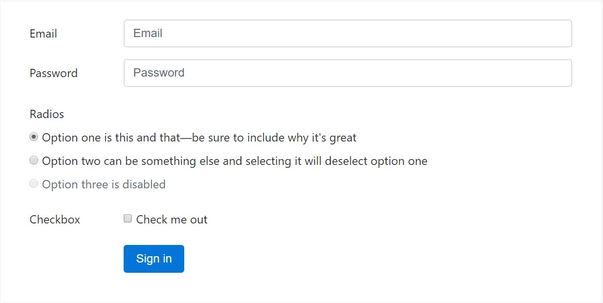
<div class="container">
  <form>
    <div class="form-group row">
      <label for="inputEmail3" class="col-sm-2 col-form-label">Email</label>
      <div class="col-sm-10">
        <input type="email" class="form-control" id="inputEmail3" placeholder="Email">
      </div>
    </div>
    <div class="form-group row">
      <label for="inputPassword3" class="col-sm-2 col-form-label">Password</label>
      <div class="col-sm-10">
        <input type="password" class="form-control" id="inputPassword3" placeholder="Password">
      </div>
    </div>
    <fieldset class="form-group row">
      <legend class="col-form-legend col-sm-2">Radios</legend>
      <div class="col-sm-10">
        <div class="form-check">
          <label class="form-check-label">
            <input class="form-check-input" type="radio" name="gridRadios" id="gridRadios1" value="option1" checked>
            Option one is this and that—be sure to include why it's great
          </label>
        </div>
        <div class="form-check">
          <label class="form-check-label">
            <input class="form-check-input" type="radio" name="gridRadios" id="gridRadios2" value="option2">
            Option two can be something else and selecting it will deselect option one
          </label>
        </div>
        <div class="form-check disabled">
          <label class="form-check-label">
            <input class="form-check-input" type="radio" name="gridRadios" id="gridRadios3" value="option3" disabled>
            Option three is disabled
          </label>
        </div>
      </div>
    </fieldset>
    <div class="form-group row">
      <label class="col-sm-2">Checkbox</label>
      <div class="col-sm-10">
        <div class="form-check">
          <label class="form-check-label">
            <input class="form-check-input" type="checkbox"> Check me out
          </label>
        </div>
      </div>
    </div>
    <div class="form-group row">
      <div class="offset-sm-2 col-sm-10">
        <button type="submit" class="btn btn-primary">Sign in</button>
      </div>
    </div>
  </form>
</div>
Final thoughts
Generally these are the basic elements you'll require in order to set up a simple Bootstrap Login forms Popup with the Bootstrap 4 framework. If you angle for some more complicated appearances you are simply free to get a full benefit of the framework's grid system arranging the components pretty much any way you would believe they need to take place.
Look at several video clip tutorials relating to Bootstrap Login forms Design:
Related topics:
Bootstrap Login Form formal documents
Training:How To Create a Bootstrap Login Form
One more representation of Bootstrap Login Form